Start Lite: Menu for cognitive accessibility
A simplified and customizable Start Menu for older adults living with dementia

Ranked #1 of 8 projects by judges from Microsoft.

30% reduced cognitive load for most common tasks.
Team
2 designers, 1 engineer and 1 marketing manager
My role
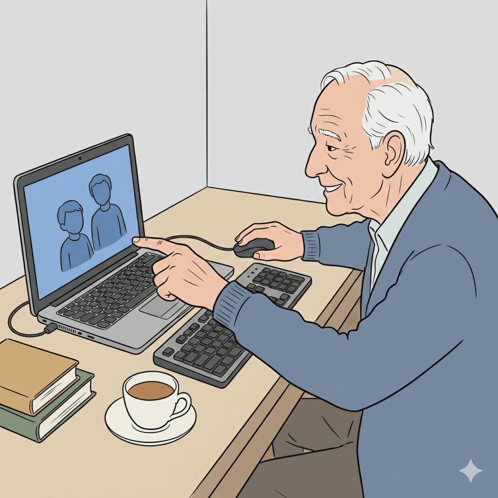
UX Designer. I initiated social media research using Reddit, was responsible for primary research at a local dementia friendly community, created a storyboard to communicate research insights, sketched initial concepts, prototyped them using Figma, tested them with users, and iterated.
Goal
The goal was to acquire and retain Windows users who are living with dementia.
Ideally, more older adults would choose to buy or continue using Windows 11 computers over others.
Designing the Start Menu would create the highest impact for the users.
Possible Impact
Acquire 55M+ new users
worldwide as the number of older adults online continually increase.
Promote Microsoft’s mission
“to empower every person and every organization on the planet to achieve more”
Discovery
We found that user sentiment does not favor Windows.
Purpose-built competitors like Grandpad, or voice assistants offer simplicity, but limit functionality.
But, of all mainstream computers, Chromebooks (installed with ChromeOS) were popularly deemed most useful likely because of the seamless Chrome integration.
Problems include choice overload and low findability.
Overwhelm due to too much information
Difficulty recalling and finding tools or files
Fear of "breaking" something

Designing the Start Menu would create the highest impact for the users.
Design and Iteration
Our initial ideas were themed on simplification and support.
From voice assistants to Windows 8-like grids, we explored how interfaces could be made simpler and how guided support could be provided.

But, concept testing revealed another story.
“Sometimes he admits he needs help and other times he struggles and struggles and finally I have to intervene…”
-Care partner in an interview
There is a tension between needing support and desiring independence.
Introducing…
a customizable Start experience in a “Cognitive Accessibility Mode”.
The reimagined Start Menu would consist of prominent “Action” items.
This makes the experience more aligned with the user’s mental model rather than directory-like. By helping users recognize items in their own words rather than recall tool names, a friction point is reduced.

1
Followed by task continuity cards.
A selection of recently or frequently opened documents or tabs will be populated in the lower section. Drawing inspiration from interaction patterns in other Microsoft tools, these continuity cards serve as visual reminders of where users left off, eliminating the need for extensive search.
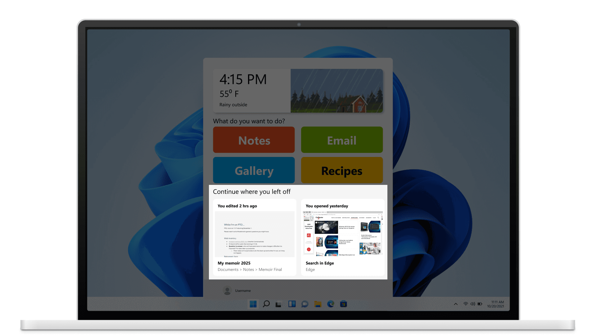
2
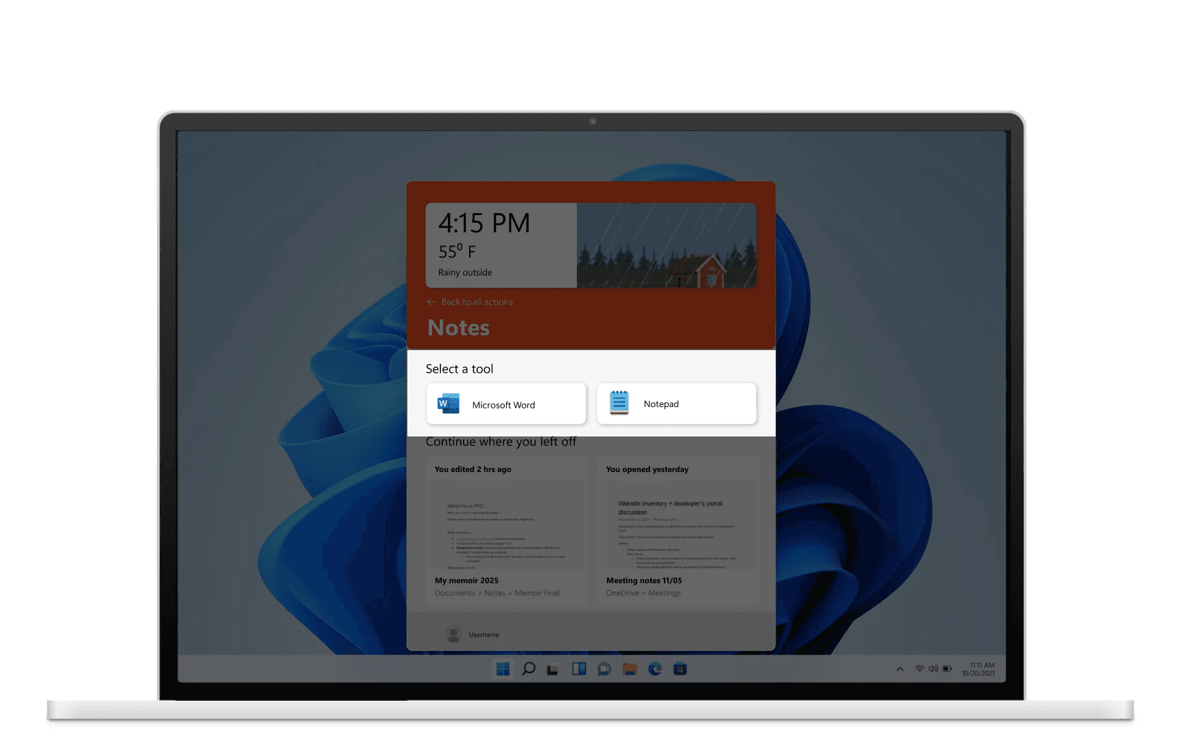
After an “Action” item is clicked, a set of relevant tools with preset conditions is presented.
By progressively disclosing options in this manner, cognitive load is reduced at each step.
We recognized that some tasks are entirely completed through browsers, so we extended this capability to Microsoft Edge. Users can select a single or a group of tabs to be associated with a particular activity, straightaway launching them into the task. This would improve productivity in a way that Chromebook does.
3
The action items would be configurable.
With the help of a care partner or independently, the action items and the tools associated with each can be set up when the cognitive accessibility mode is switched on.
4
Testing with our target user group revealed positive sentiment but need for refinement.
Desire for order and details.
Need for reliable search.
Lack of exit signifiers.
Impact
This way, we could achieve a 30% reduced cognitive load on common tasks.
Our testing results were generally positive and indicated success. Due to a reduction in the available options at each step in the way, an average of 30% of the effort is reduced. We were applauded by a Microsoft PM and a Microsoft SWE for an exceptional project.
Reflection